Dashboard
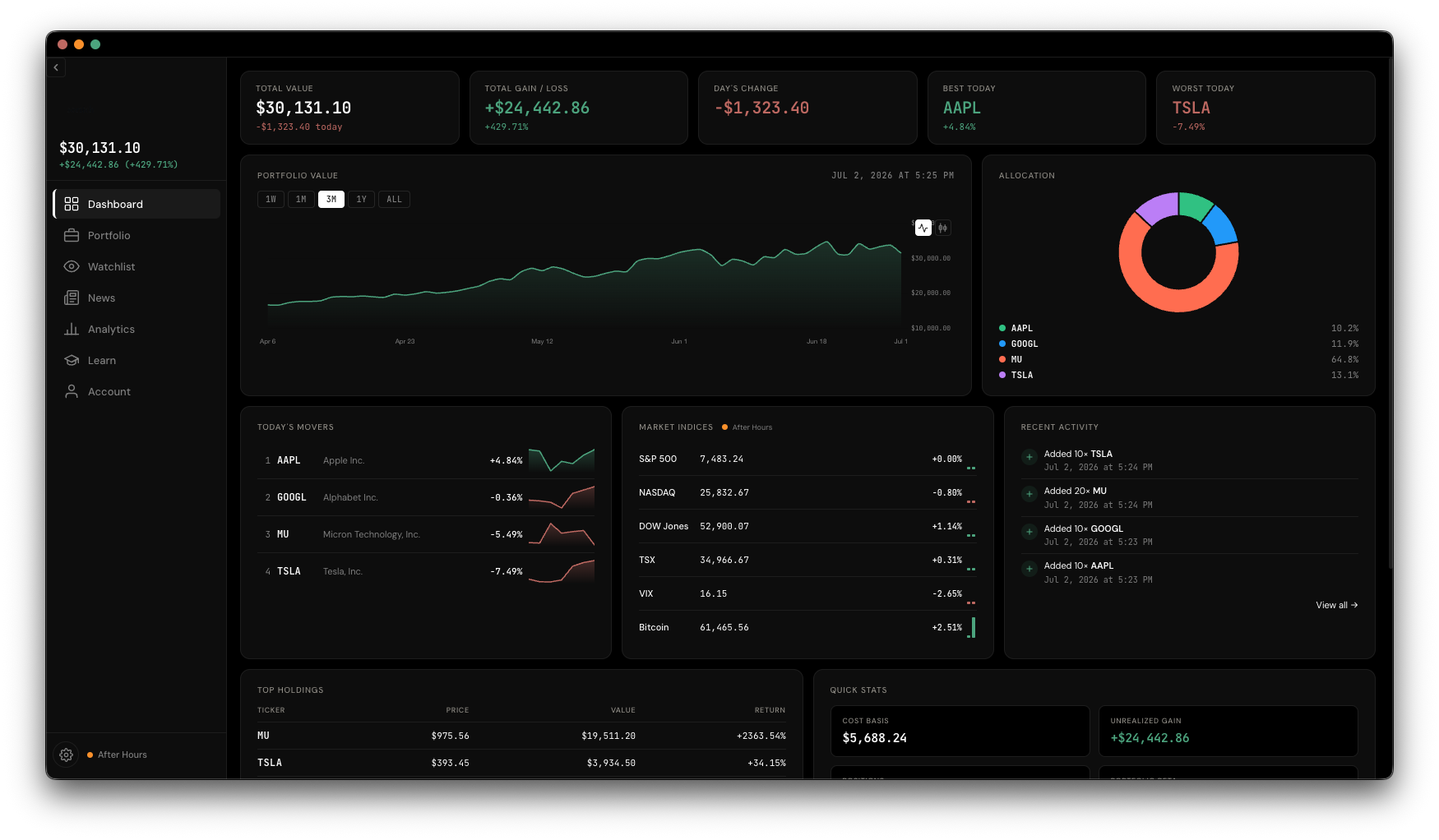
The Dashboard is the first thing you see after signing in — a read-only overview of everything you hold. Nothing gets edited here; it's built entirely from your Portfolio and Watchlist, so it's a good habit to start your day on it.
Across the top you'll find your total portfolio value, your all-time gain or loss in dollars and percent, today's change, and your best and worst performer today. Until you've added a holding, these show a dash instead of $0 — that's the app's way of telling "nothing here yet" apart from "you're literally at zero."
A line (or candle, depending on your chart style) tracking your total portfolio value over time, built from every holding's price history combined. Use the range chips — 1W, 1M, 3M, 1Y, ALL — to zoom in or out.
A donut chart breaks down what you own by holding, so you can see concentration at a glance. Next to it, Top Movers ranks your holdings by today's percent change, each with a small sparkline.
A strip along the dashboard tracks the broader market regardless of what you personally hold: the S&P 500, NASDAQ, DOW, TSX, VIX, and Bitcoin, each with its current price, change, and a mini history chart.
A stats card summarizes your cost basis, unrealized gain, how many positions you hold, and your portfolio beta — a rough measure of how much your portfolio tends to move relative to the market as a whole. Below that, a mini table lists your top 5 holdings by value, and an Activity Log shows your most recent adds and removals.